How We Redesigned Our Search Experience
Search is a critical phase of any booking funnel. At GetYourGuide, the Search team is striving to enhance the user experience for our customers.

Senior Full Stack Engineer
Key takeaways:
Bhavna Banerji, senior full stack engineer, gives a step-by-step look at how the Search team made it easier for users to narrow down to their preferred activities and experiences on the GetYourGuide search page. Before the big redesign, the team first migrated to a new tech foundation — a fundamental step to ensuring faster and smoother development.
{{divider}}
Search is a critical phase of any booking funnel. At GetYourGuide, the Search team is striving to enhance the user experience for our customers. We’ve been aware for quite some time that there were some usability issues with our Search and Discovery experience. We conducted multiple user testing sessions and found some common themes
- Too many filters that were not organized.
- Many duplicate activities.
- Inability to differentiate between activities in search results.
- Filters were hard to find on mobile web.
When we decided to tackle these challenges, the Search team was formed. We were tasked with helping customers discover what’s possible in a destination and create refinement tools to help find the perfect activity.
You may also be interested in: 3 skills to elevate your influence as a UX researcher
Before we started this project, we decided that if we wanted to place bigger bets, our starting point would be to rework our codebase to ship changes and get quicker learnings. At the time, our codebase was a legacy monolith, and it consisted of Backbone with Smarty templates and PHP. This was a much slower developer experience, and features took longer to build and ship. We decided to migrate to a new tech stack while improving the user experience.
{{divider}}
Preparing the foundation of the new Search experience:
- Tech migration: We meticulously planned this migration to the new tech stack with VueJS and Node on frontend and Java and Elasticsearch on the backend service. We listed our dependencies on our old monolith and decided to start with an MVP version where we didn't migrate all the components all at once. We called this the ‘Tech Foundation’ project.
- New Search experience: We gathered and prioritized our most important bets via user research and brainstorming sessions between UX designers and engineers.
We invested a quarter on migrating and thoroughly testing out the tech foundation, and then we started redesigning and experimenting with the different search components in the following manner:
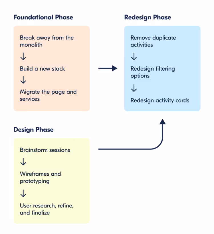
Redesigned filters: By flattening the hierarchy in the filters, we helped customers find relevant filters more quickly. We also introduced filtering capabilities based on interests to address feedback from customers.
Old nested filters:

New Flat Filters:

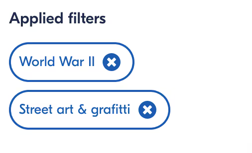
Applied filters and result counts: We added an applied filters section to allow users to quickly see applied filters. On mobile web, we also added a result count to provide feedback on the impact of applying filters.

Quick filters for Today and Tomorrow: Many of our customers search within a day of booking. To make this easier we added Today and Tomorrow buttons to quickly find available activities.

Redesigned activity cards: In the new design, we utilized the real estate on the cards more effectively, adding the most important labels and attributes (as collated from our user research sessions). This new design helped our customers differentiate better between activities.
{{divider}}
Old cards:

New Cards:

Overall, we have already seen a 3.5% uplift in engagement on the Search page with the redesign project. Many more feature improvements are actively being worked on.
What’s next for the Search team?
By now you’ve had an insight into our principles and approach towards redesigning the Search experience. Since we migrated a year ago, we have run many experiments, gathered learnings and reiterated with more improvements. This framework has helped us make data-driven decisions while keeping customer needs at the core of all of our decisions.
We are currently redesigning the Datepicker and the Search autocomplete and also redesigning our most used filters based on user data. Additionally, we are preparing to introduce Kafka and Postgres to our tech stack.
Acknowledgements:
The redesign and Tech Migration projects resulted from the effective collaboration within the Search Engineering team, Data Analytics team, and UX, Design, and Product team members. From ideation to shipping these projects, everybody proactively carried out brainstorming sessions, provided valuable insights, and helped us gather learnings effectively as a team.

More articles like this
.png)
.png)