Improving User Experience by Boosting Runtime Performance (Part 2 of 4)
In the last blog post, I shared the background of our project centered on boosting User Experience in the GetYourGuide app through enhancing performance in iOS.

iOS Engineer

Key takeaways:
In part two of a four-part series, Senior iOS Engineer Bruno Rovea focuses on the GetYourGuide app’s layout, and the role it plays in enhancing User Experience. From layers through to how to blend them, we’re sharing our findings to make your app-building experience a little bit easier.
In the last blog post, I shared the background of our project centered on boosting User Experience in the GetYourGuide app through enhancing performance in iOS. We all know that milliseconds matter, and that’s why a first step should be creating a fantastic layout that’s capable of moving seamlessly through multiple screens.
{{divider}}
Improving UX in iOS: Layouts, Layers – And a Lot of Blending
Building any app screen is composing a tree of subviews that make the final image seen by our users. While it's as simple as creating a UILabel or a UIImageView, adding them as subviews, and adding constraints that will position them in the screen, the app screen can also be a very complex hierarchy of multiple subviews on top and beside each other. While the system can provide an optimal performance for most cases, sometimes the developers need to intervene and help the system to optimally render the hierarchy by providing hints using the built-in API.
First, we need to understand that what was said before is only half true: in reality everything we see on the screen is a layer; and every single UIView and subclass of UIView, like an UILabel and an UIImageView, is ultimately simply a bunch of layers. All these layers are blended together from the root down to the leaves, which is done by the system during the render loop we saw before. As we can imagine, this layer composition needs to happen fast.
As an aside, from a technical point of view, UIKit leverages the Decorator pattern to add more functionality to components that have UIView as the most basic unit.
For our screen, we have a relatively simple view hierarchy, with just one complex component that we call Activity Card, which is embedded in an UITableViewCell and is used to present our Activities details. We make use of an infinite scroll feature to seamlessly load more Activities while the user scrolls the list. Although all the subviews in the screen should be taken care of, since the Activity Card is a more complex component and our list component is on top of an UITableView, which makes use of reusable cells, we need to make sure the cell initialization and (re)configuration is optimal.

Constraints
Constraints are used to position our layers views in the custom components, which are then composed until it's finally positioned in the ViewController's view. They need to be created in a way that is not ambiguous to the system, otherwise the system must spend resources to decide what to do with conflicting ones, by breaking in priority order during runtime. The recipe is as simple as making the view hierarchy as flat as possible while setting the minimum constraints that would make up for a valid UI composition.
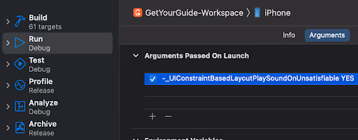
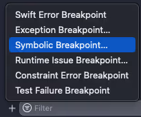
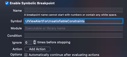
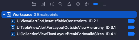
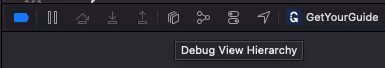
There's no silver bullet to tackling this; it just takes trying it out and monitoring for inconsistencies. It's possible to check the constraints by adding symbolic breakpoints and even sounds when developing, but it’s also possible to inspect using the Debug View Hierarchy in Xcode.
Play sound alert when breaking constraints:
Symbolic breakpoints:
Debug View Hierarchy:
It's a good idea to keep an eye on the console, where breaking constraints are also printed, stating which constraints are involved, the reason for breaking it, and how the system tried to solve it.
As an example, by not setting constraints or compression/hugging priorities correctly we can have views with either ambiguous vertical and/or horizontal position, and/or height and/or width. In other words, we can have all the possible permutations. That’s what’s shown below in the warning received when using Debug View Hierarchy:
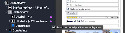
In this case, we have two labels embedded in a UIStackView, but they don't have any information on when they should stop growing, which causes the inconsistent UI and the ambiguous width and horizontal position.
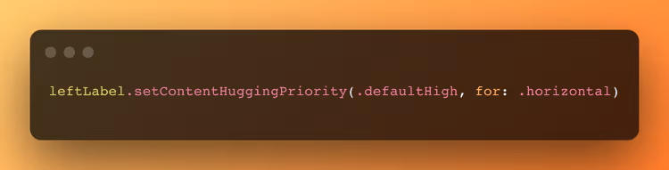
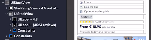
We can fix it by telling the left label to not grow itself more than its intrinsic size, while the right one is free to do it if needed. This resolves the UI to the desired design and fixes the warnings:
Note: The inconsistent UI was done for demonstration purposes, although ambiguity can happen even if we've already achieved a desired consistent UI. It’s therefore always wise to verify.
Breaking constraints can be solved by reorganizing them or updating their priorities according to the design's requirements. To facilitate the work with constraints we chose to leverage the use of UIStackView, which are very powerful on organizing the UI while automatically setting all the needed constraints between its arranged subviews. The only constraints we normally set are related to specific sizes, and setting hugging priority and compression resistance.
UIStackView also provides a very useful feature for controlling the arranged subviews constraints. When an arranged subview needs to be hidden the constraints for all the arranged subviews are reorganized automatically by the system, so we don't need to manually control them. (Probably you are remembering the many times you worked on a code where a lot of constraints were declared as stored properties in the View file).
In our use case, we can update the layout between the different Activity Card states below only by hiding/showing views and not using one single line to update constraints or make the system update the layout by calling either setNeedsLayout or layoutIfNeeded, which are expensive functions (both can be measured with the Time Profiler instrument if you're curious).


Sizing
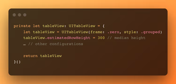
Since the Activity Card component has dynamic height by respecting the possible layouts the constraints give, so do the cells, which means the system needs to calculate the cell's final height to be able to display it correctly. In our case, when used together with the estimatedRowHeight property set, which provides a performance boost when used correctly, we are suffering very little to no performance penalty by using the approach described in the topic above:
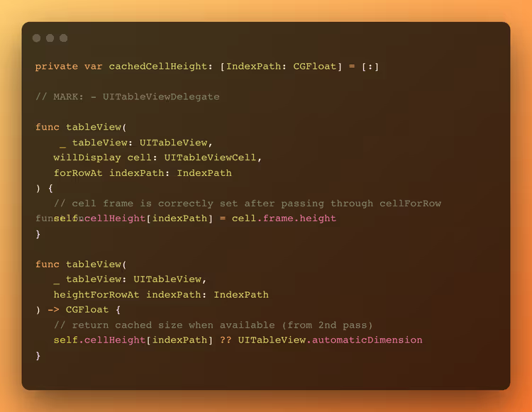
And we even make it to our advantage to cache the cell size after it's first rendered and return it from the second pass, so the system does not need to calculate it again. Here’s how:
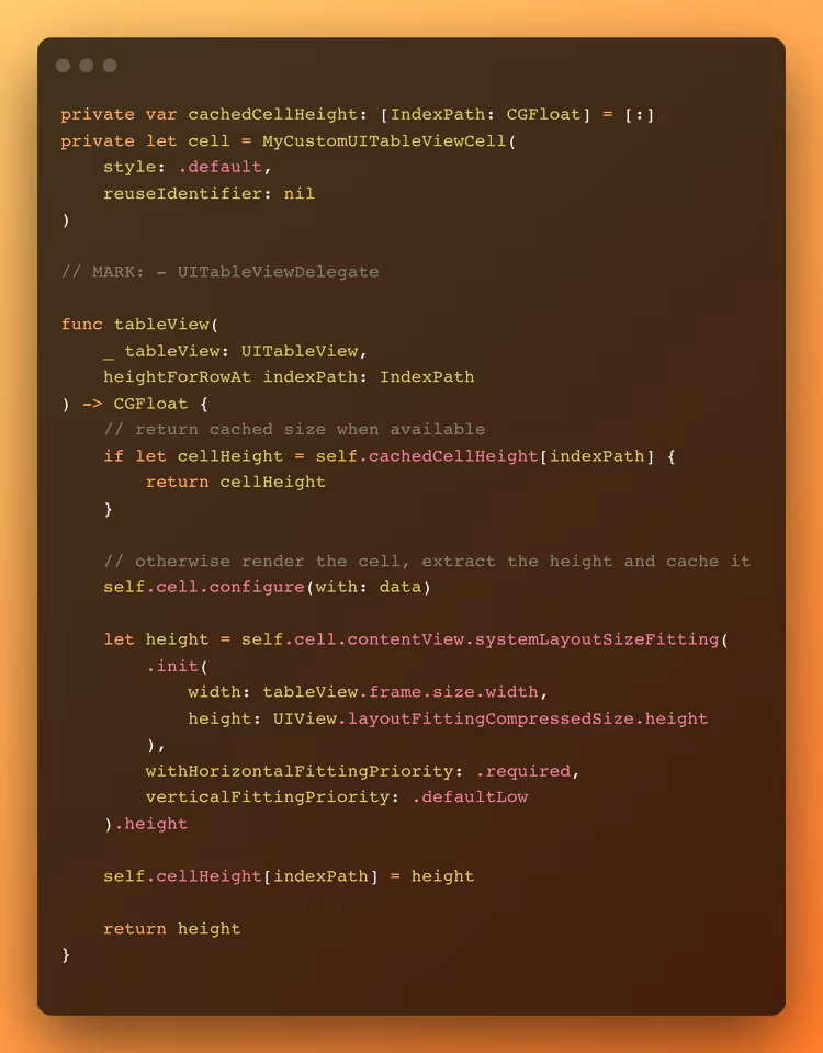
It's also possible to make use of a single cell instance to render each indexPath to return the exact value before each first pass as can be seen below. This approach had a worse performance than the previous one for us but can have a better performance for your use case, so it's valid to explore both, especially if you have many different cells and heights.
Reusability
In the first iteration for the Activity Card component, we set only the static subviews as stored properties and were creating the dynamic subviews on demand. This was achieved using a configure function, which is called in UITableView's cellForRow function. They were destroyed using the prepareForReuse function, inside UITableViewCell, which is automatically called when the existing cell instance is going to be reused by the UITableView.
This approach seemed logical, since we created the exact layout needed by each state, but by using the Time Profiler we could check how much the operations were consuming in this flow.


As we can see, the operations are expensive and could impact the render loop, but we also were going against what Apple documentation says about how we should be using the prepareForReuse function. To tackle that we used a similar approach used by UIKit to deal with cells: keeping the dynamic subviews in memory and updating them according to how they are needed in each state. The approach slightly increases our memory footprint (<0.1% increase). Doing this small change and properly using the configure and prepareForReuse functions brought great performance optimizations as can be seen below:


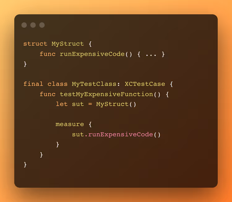
If we have an expensive function that can affect the user experience (or actually any function in the codebase), we can create a very simple unit test using the measure function to measure the performance to prevent regressions when changes are done:
Note that we should have similar hardware and software configurations between clients and the CI environment so the results are not affected by a (much) slower machine or misconfigured environment, which could emit a false positive.
Layer blending
As mentioned before, the view hierarchy should be as flat as possible on Z-axis. This is to simplify the layer composition by the rendering system, which needs to blend, at pixel level, each view with its subviews in a recursive way from the root view to the leaves views. The blending operation can become very expensive when views use (any level of) transparency and different background colors, especially when many levels of subviews are composed on top of each other. Conversely, opaque views and using the same background colors optimize the operation.
In practice, flattening the view hierarchy is not always possible as we can see by our Activity Card component, but we still can apply some changes that help the system to blend the layers.
By default, UIView and its subclasses don't have a background color. Sometimes we specifically set it to transparent so the view can inherit the parent view background color. This is because most times the subview has the same color as its parent view, while this parent view also should have the same background color as its parent view, and so on. Although this seems logical, it becomes a nightmare for the rendering system, since it needs to calculate all possible transparencies and compositions that may exist between all the views hierarchy.
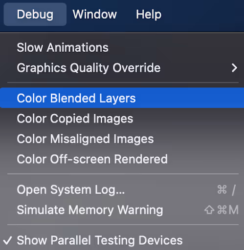
This can be validated by running the app in the simulator or device with the Color Blended Layer option enabled inside the Simulator's Debug menu or in Debug -> View Debugging -> Rendering menu inside Xcode, which will tint the affected layers in green or red depending on if it's blended or not.
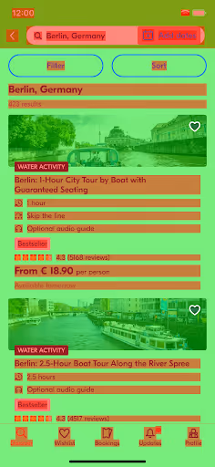
As we can see below on the left, this is how the system sees the layer blending composition in the screen when we don't set the background color and make the views opaque. To tackle that we should manually set all the views’ background color and ensure that the isOpaque property is set to true.
This helps the system to identify when the layers do not have any transparency and can be easily blended with underlying layers when they have the same background color. On the right we can see the final result after adjusting all the possible subviews for our use cases. As you can see, some images are not handled – we’ll get to that part later.

Rasterization
Another point about layers: when a view will be blended and composed with other views – for example, the Activity Card component being blended in the UITableView – if the original view will be animated/moved, but it doesn't animate or transform any of its subviews, we can transform the view in a rasterized image. This would prevent unnecessary re-rendering. The capability is achieved by setting the layer shouldRasterize property as true.
We need to reinforce that this can increase the performance if used correctly, or dramatically decrease the performance if used incorrectly – i.e., when any animation or transformation is applied to its subviews. The images created by the system are cached and if not reused in ~100 ms, the image is deleted. The cache is controlled by the system and cannot be modified, so we need to use it with caution to not overuse it.
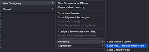
This can only be validated by running the app in a real device with the Color Hits Green and Misses Red Images option enabled inside the Debug -> View Debugging -> Rendering menu inside Xcode. This will tint the views in red or green depending on if it's rasterizing correctly or not.
Tip: If the view keeps blinking from red to green, there's something being animated or rendered in the component. If for any reason it cannot be stabilized, disable the rasterization option since a new image is being created every single time green appears, which decreases the performance.
Below we can compare the different states:
Left: No rasterization enabled in the App, but we can see that Apple rasterizes the battery component.
Middle: Rasterization enabled for some components and preparing to cache the rasterized images.
Right: Rasterization enabled and image cached for the components.

When on the last state, scrolling the list doesn't cause a new rendering or creation of a new rasterized image for the already cached ones since none of the cells' subviews are being animated. This improves the scrolling performance.
Asynchronous drawing
In the opposite direction to rasterization, we can defer the view drawing to a background thread when the view is constantly animating its layer. For example, the effect of emitting particles or constantly moving effects would cause the blending to underperform. This can be achieved by setting the layer drawsAsynchronously property as true.
At the moment we don't have any use case on the screen, but it's valuable to point it out anyway :)
Off-screen rendering
As we mentioned in the render loop, a single buffer is used to draw all the layers on the screen. However, when we add effects to subviews, like (wrongly) applying shadows or masks when using corner radius, the layer is drawn off-screen, meaning a new buffer is created specifically to handle these specific cases. The problem with that is the graphics processing unit (GPU) needs to sync the buffers contexts to be able to deliver the final image, which can become expensive and cause frame drops.
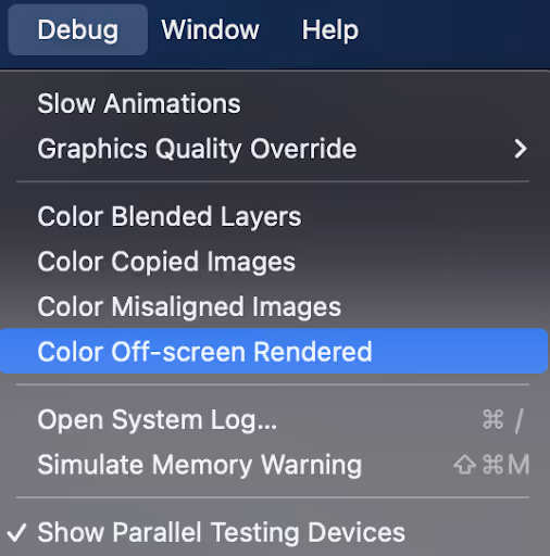
This can be validated by running the app in the simulator or device with the Color Off-screen Rendered option enabled inside the Simulator's Debug menu or in Debug -> View Debugging -> Rendering menu inside Xcode, which will tint the affected layers in yellow.
As we can see in our screen below we have some off-screen rendering happening because of cornerRadius being used in some views. Although this is currently not affecting the performance in a noticeable way, we should be mindful of it.
Important note: Rasterized views are rendered off-screen, so for demonstration purposes we disabled it for the app's components. That’s why only the system components, like the battery component, are still rasterized.

To tackle that we need to first understand if the applied masks are really necessary. Analyzing the cases we see here, we found that the UILabel, for example, does not need the maskToBounds property set to true to apply the corner radius, which forced the system to unnecessarily render it off-screen. By removing it we were able to stop the off-screen rendering while keeping the same UI.

For the other use case, where we apply a corner radius to the Activity image, we would need to apply the effect in a different way, like drawing the mask using the CoreGraphics' drawIn function instead of relying on the built-in mask. More on that later.
My suggestion would be to explore how your app is behaving, check for unnecessary uses of masks, and analyze the performance cost of it to think about possibilities for different approaches.
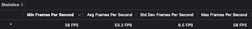
With the applied optimizations, this is difference in performance gathered using Instruments:
Before (which will also serve as a benchmark for the other improvements):

More articles like this